The Benefits of SEO
May 21, 2013
Building a Successful Account Team
June 21, 2013Late last year, Pete Cashmore wrote on Mashable that 2013 is the year of responsive web design. Why? Well, in the fourth quarter of 2012, PCs saw year-on-year sales decline for the first time in more than five years. Just think about it; do you have a smartphone or tablet? Do you view web pages on it? I do, and I can tell you that it’s very frustrating to view a website on my iPhone that isn’t formatted for its small screen.
At the beginning of this year, I finally got around to redesigning my personal website. It had been neglected for almost 10 years and was overdue for a major overhaul. I was determined to use some of the latest technology now available with HTML5. After three months of developing a static website — styling nav bars with CSS3 and incorporating scrolling effects with jQuery plug-ins — a co-worker convinced me to make my design responsive.
During the course of my site development, I had already begun researching various Content Management Systems (CMS) and was just about ready to scrap my hand-coded redesign to jump over to Joomla (a widely popular open source CMS platform), but then I discovered front-end frameworks. There are many from which to choose, and the choice can prove a little overwhelming, especially for someone like me who hasn’t written much code in 15 years. I was looking for something that was feature-rich, relatively intuitive, free and had a UI (user interface) kit I liked.
I narrowed my choices to three:
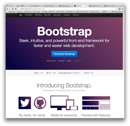
Bootstrap http://twitter.github.io/bootstrap/
Foundation http://foundation.zurb.com/
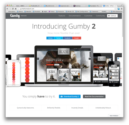
Gumby 2 http://gumbyframework.com/
I selected Gumby 2 for its intuitive code structure and its attractive UI kit. The real beauty of responsive web design is the ability to change the way your site displays for multiple display sizes, giving you full control over the user experience regardless of device type – from desktop to smartphone. Through media queries you can change font sizes, colors, visibility or any CSS attribute. Essentially you are designing multiple sites all with CSS. My site displayed on an iPhone looks more like an app than a website, and that’s important when you want to engage mobile visitors.
Another route besides front-end frameworks would be to choose from the many responsive templates for popular CMS platforms, which could have you up and running in a few hours.
If you are ready to transition to a responsive site design, contact Domus, Inc. today and consult with our web experts to help you determine the best path for you.
Sean Hockabout is the Senior Manager of Graphic Design at Domus, Inc., a marketing communications agency based in Philadelphia. For more information, visit http://www.domusinc.com. For new business inquiries, please contact CEO and founder of Domus, Inc. Betty Tuppeny at betty.tuppeny@domusinc.com or 215-772-2805.


